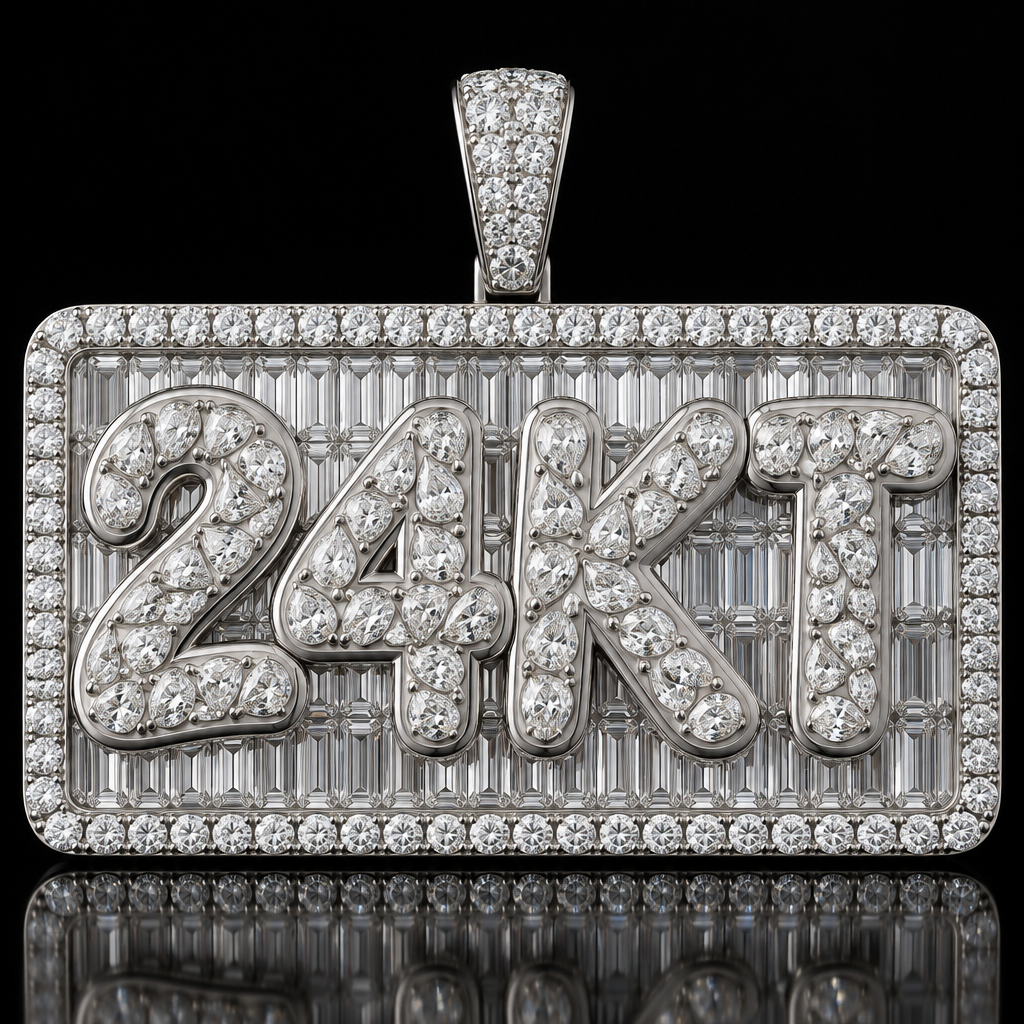
Use the attached image as the primary design reference. Create a highly photorealistic, meticulously finished version of this same “24KT” pendant, preserving its overall proportions, construction, lettering style and front-facing presentation. DESIGN AND CONSTRUCTION A rectangular polished white-metal pendant with softly rounded corners. The outer border consists of a continuous single row of round brilliant diamonds in shared-prong settings. Behind the lettering, the entire rectangular field is filled with closely fitted emerald-cut diamonds in an invisible-setting arrangement, with clean alignment and minimal visible metal. A tapered diamond-set bail sits at the top center. The raised “24KT” lettering has the same chunky, softly rounded, slightly asymmetric sculptural character as the reference. Preserve the fullness and flowing contours of the characters. PRIMARY CORRECTION: PEAR-CUT FLUSH SETTINGS Completely replace the irregular stone layout on the lettering with a carefully planned arrangement of small pear-cut diamond melee, each individually flush-set into the solid metal. Every diamond must have a complete, well-proportioned pear outline: one rounded end, symmetrical curved shoulders and one pointed tip. Each stone must occupy its own precisely fitted, independent pear-shaped seat. The diamond tables should sit level with the local surrounding metal surface. The metal must meet each stone closely and cleanly, with a very fine burnished edge integrated into the letter surface. No raised bezel walls, visible prongs or deep recessed pockets. Use small stones and closely spaced, thoughtfully nested orientations to cover as much of each letter face as possible. Follow the curves and direction of the lettering. Maintain narrow, smooth, continuous metal bridges between adjacent stones so that every individual setting remains clearly separate. Use a limited, consistent range of calibrated pear sizes. Where space becomes narrow, use a smaller complete pear or leave a small polished metal gap. Never stretch, truncate, merge or deform a stone to fill a space. The metal between the settings must remain smooth and continuous, without valleys, ridges or a melted appearance. Preserve a slim, clean polished margin along the outer contours of the lettering. IMAGE QUALITY Create a convincing luxury jewelry studio photograph with crisp diamond facets, realistic reflections and highly polished white metal. Use controlled lighting that clearly reveals the stone shapes and setting edges without excessive glare. Show the complete pendant straight-on against a deep black background, resting on a glossy black surface with a subtle reflection, matching the reference composition. Keep the entire pendant sharply focused. Request 2160 × 3840 portrait resolution, with fine details remaining clear under close inspection. AVOID Shared cavities beneath multiple pear diamonds; communal sunken channels; overlapping stones; merged outlines; triangular filler fragments; incomplete pears; marquise or oval substitutes; distorted facets; random seat depths; dark trenches around stones; thick raised bezels; prongs on the lettering; oversized stones; excessive exposed metal; warped lettering; sketch lines; pencil texture; painterly surfaces; blurry or melted jewelry details. PRIORITY Preserve the reference design and produce clean, individually readable pear-cut flush settings. Achieve dense coverage through careful sizing and placement, never by compromising stone shape or merging the individual seats.
Keep exploring
More None
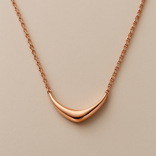
Beautiful rose gold necklace
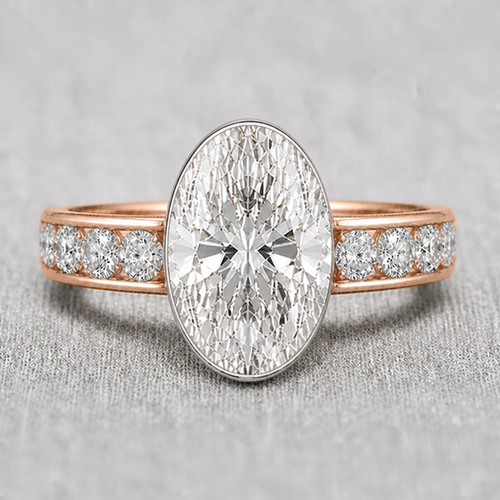
bezel should be thinner to none when it reach the east and west sides of the oval
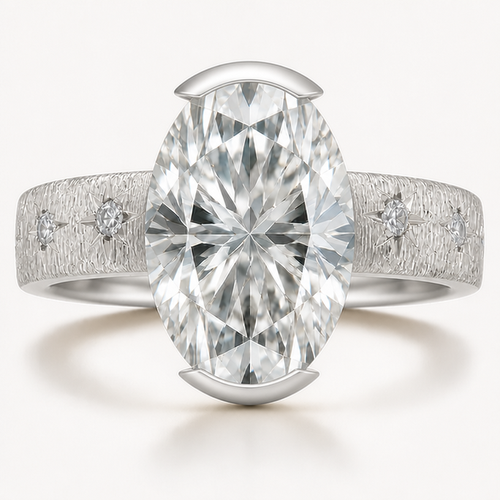
the bezel seamlessly difuse from thick at north south to thin then none east west and in platinum
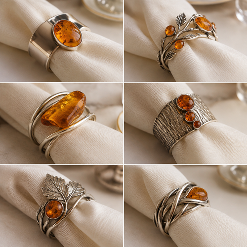
Dobilo ziedas , serveteles ziedai restoranui, gintaras sidabras, keleta variantu
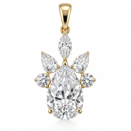
Create a photorealistic high-jewelry pendant based strictly on the uploaded sketch. Preserve the exact silhouette, propo...
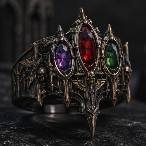
I want a ring with three stones, purple, green, red. And I want it to be overly gothic, kinda like the universe Warhamme...
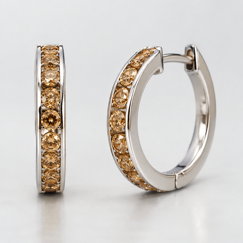
White gold hoop earrings, flat with yellow brown diamonds 3.2 mm in the center, english clasp
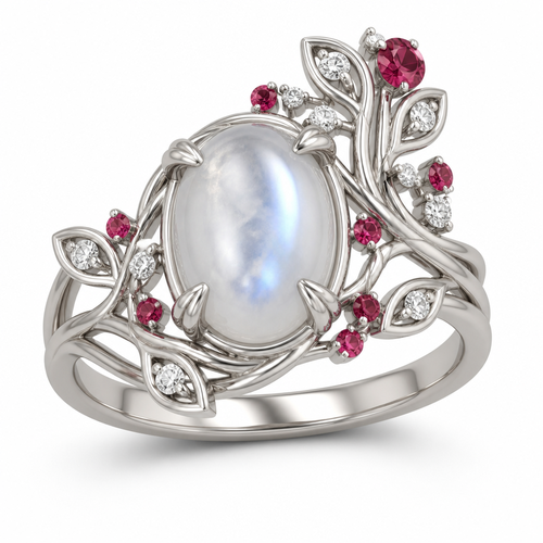
Create a highly accurate 3D jewelry design based on the supplied reference image. Reproduce the ring’s overall architect...
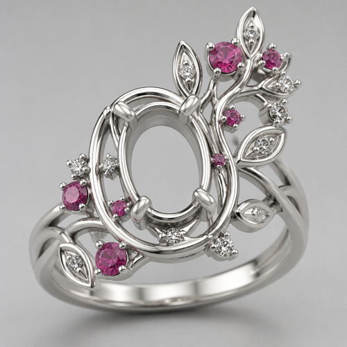
Create a highly accurate 3D jewelry design based on the supplied reference image. Reproduce the ring’s overall architect...
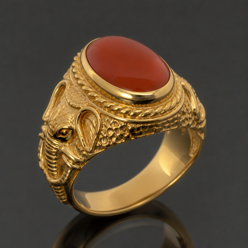
Men’s Persian signet ring, elephant shank, oval carnelian agate, raised crown setting, yellow gold
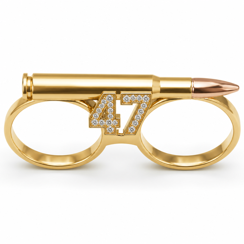
Double finger ring connecting the ring finger and pinky, 10K gold, shaped like a 7.62 caliber bullet, with the number 47...
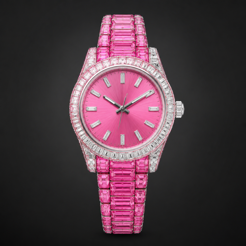
Hot pink Rolex watch
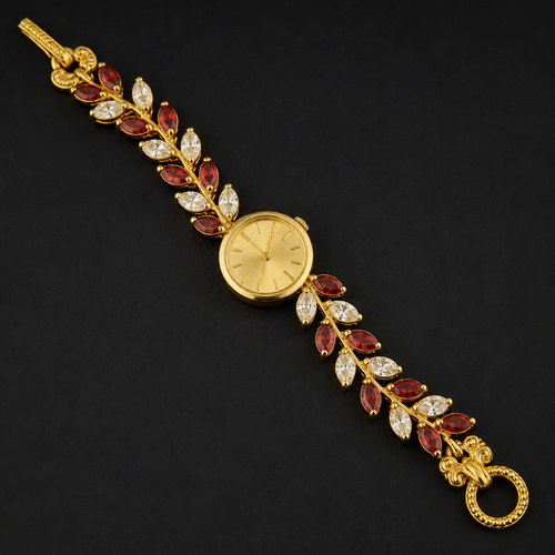
Watch Dial: Positioned in the center of the bracelet, featuring a small, elegant round shape with a polished gold bezel,...
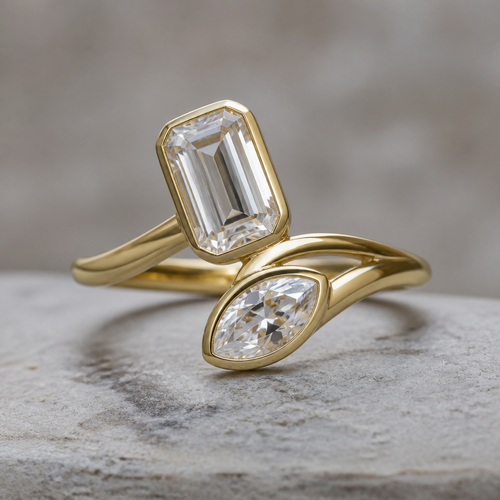
1.60 emerald cut and 1 ct marquise half bezel ring with curves
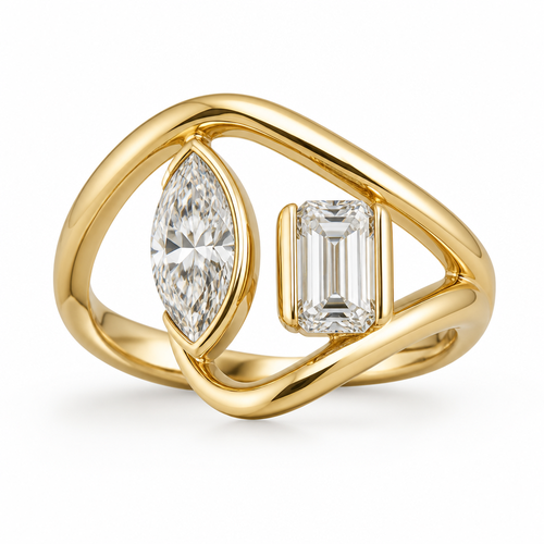
Create a modern, sculptural bypass engagement ring in 18K gold. The design should feature two different center diamonds ...
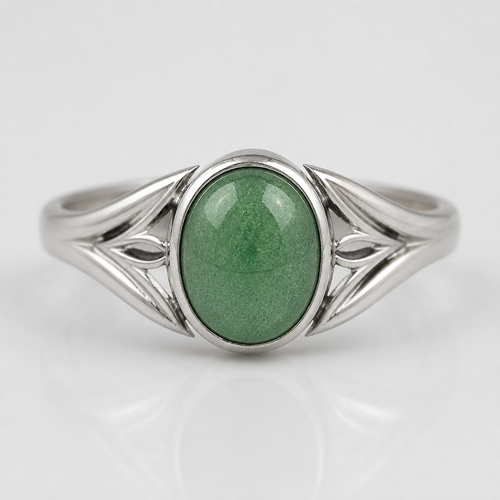
Silver ring eith green avantiurin stone in all the midlle of all ring
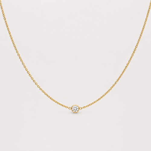
Una collana d’oro sottile con al centro un piccolo cristallo a cerchio
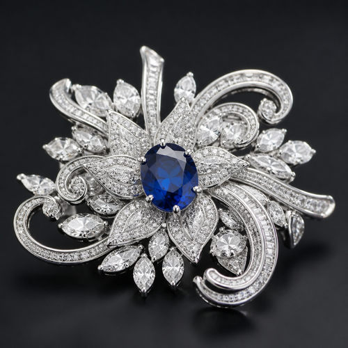
Luxury brooch
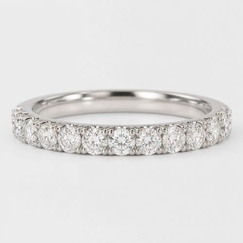
Diamond wedding ring
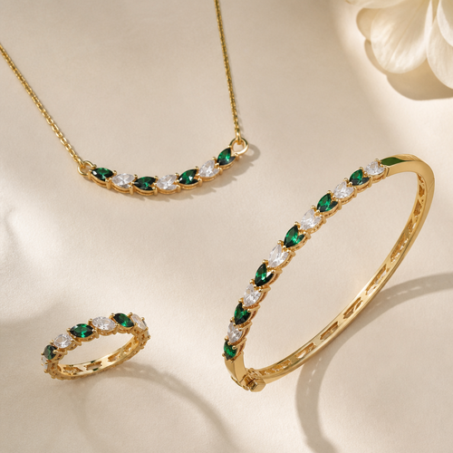
Do a complet set tela colorr a ring a barcaletee and a ring neckles
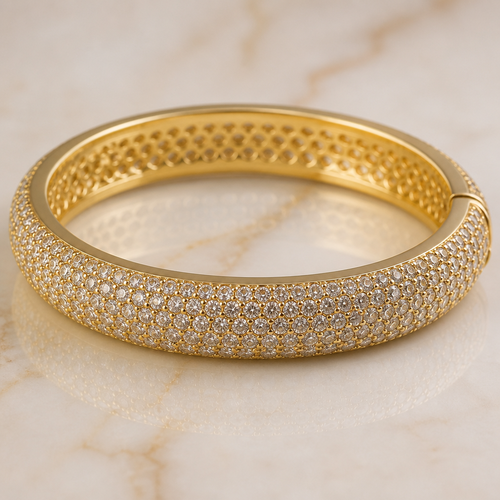
bracciale bangles spesso circa 1 cm in oro con pietre piccoline
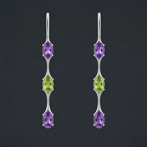
Create a sophisticated and delicate jewelry design for the AURA GEM collection. Design a pair of long, dangling earring...
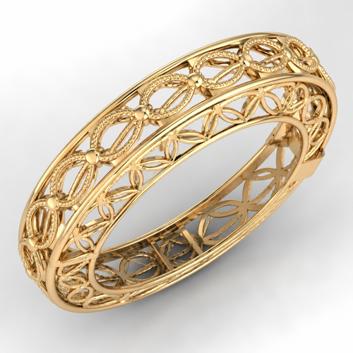
Cad bangles
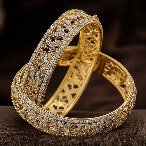
Fancy bangles
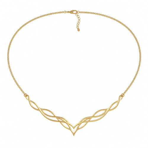
Cad plain necklace
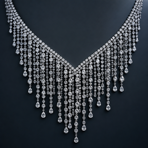
Diamond rain
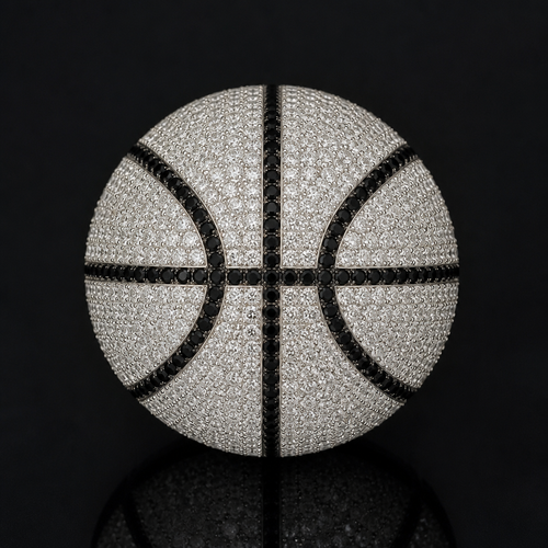
Basketball diamonds white and blacks black diamonds as lines
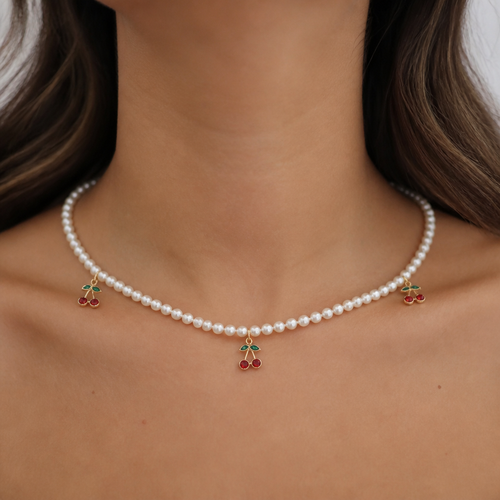
5mm pearls in one line all around the neck and three Cherry charms 2mm with gold lining,one in the middle of the necklac...
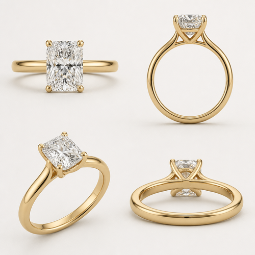
I like lab diamond (CVD) Should be between D E F diamond color Ideal cut not too deep or shallow Want 2 carats diamond...
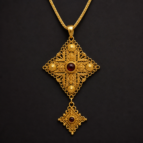
Habsha traditional, January
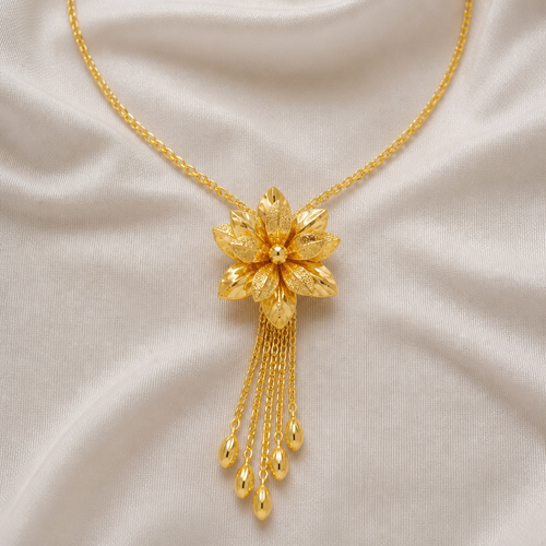
UAE gold
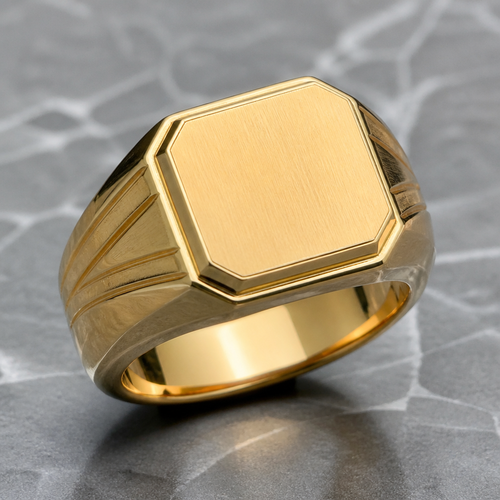
Gents ring solid
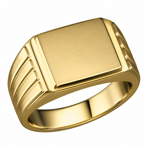
Gents ring solid
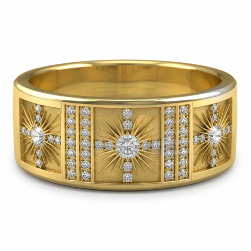
Masculine wedding band and gold 14 karat Center stone 0.50 carats sunburst with 0.01 diamonds on X axis of sun burst Sid...
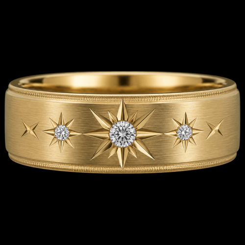
Center 0.50 ct stone receives the largest sunburst. * Two 0.25 ct side stones receive proportionally smaller sunburs...
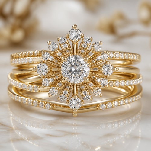
Can you create a very feminine diamond ring for a wedding ring and engagement multi stackable yellow, 14 carat gold that...
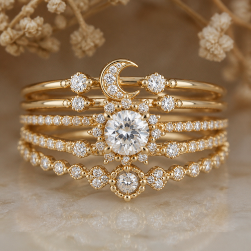
Can you create a very feminine diamond ring for a wedding ring and engagement multi stackable yellow, 14 carat gold that...
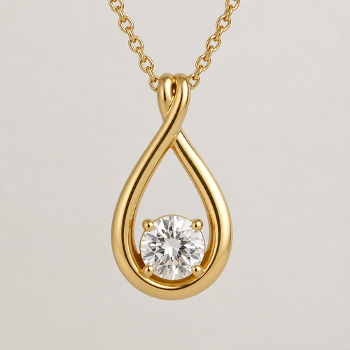
Is this gold?
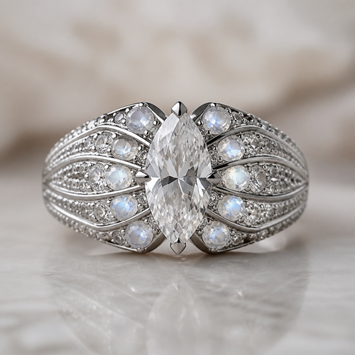
Hey Ai. Generate an engagement ring picture for me in which in the centre there is diamond in marquis shape. Ring 15mm w...
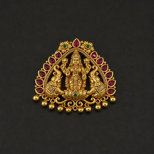
Lakshmi moopu paper casting
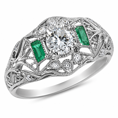
14k white gold filagree vintage inspired diamond and emerald ring
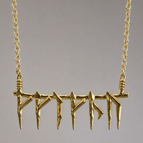
𐒈𐒚𐒑𐒖𐒕𐒖